What defines a good design? For me, as a consumer, it’s a result of creative, yet pragmatic thinking which completes two primary functions: inspiration to the viewer and day-by-day functionality.
Now let’s talk architecture and ways the above mentioned can be found in the building.
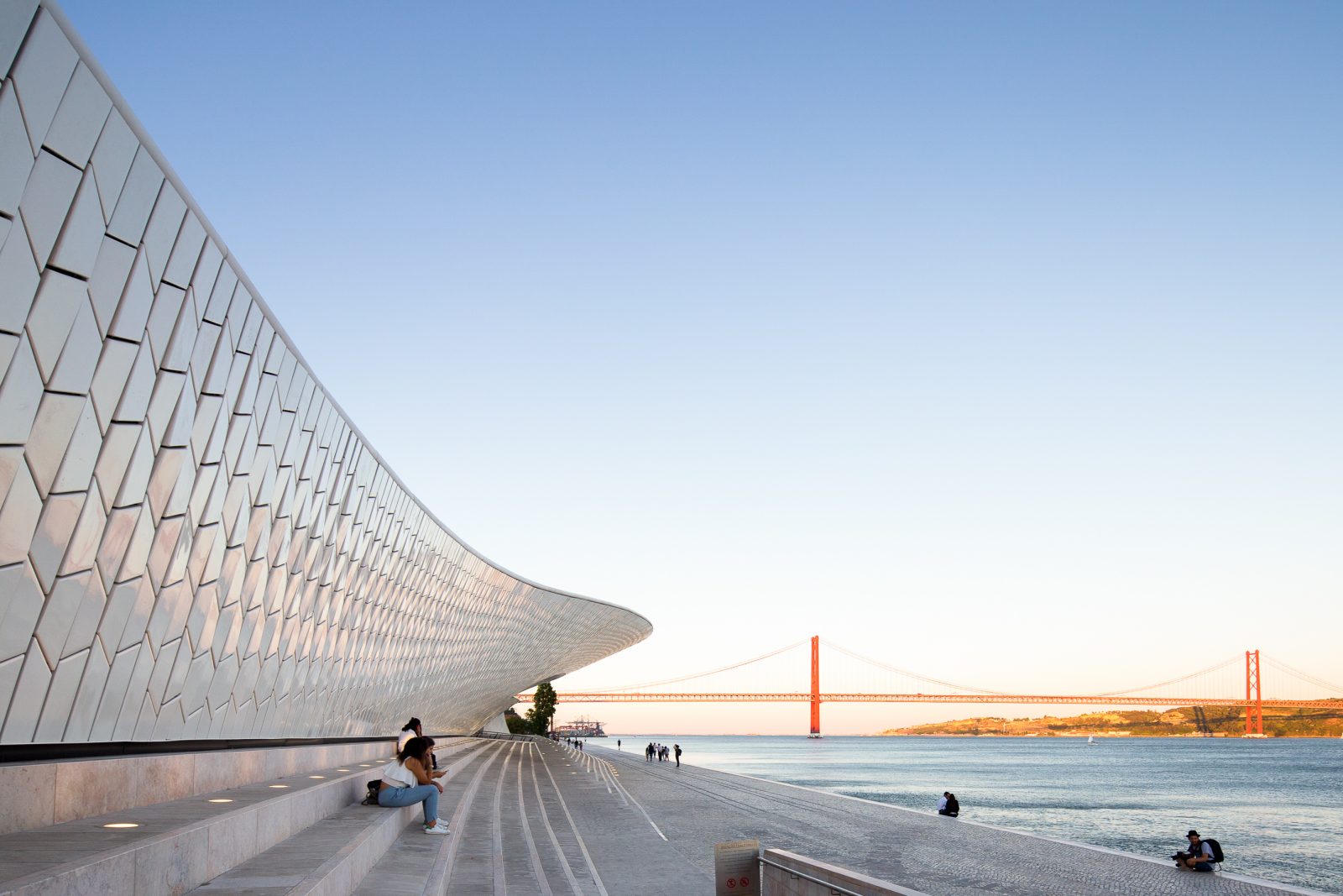
My first encounter with MAAT (Museum of Art, Architecture and Technology) designed by Amanda Levete was literally by accident. And it was a jaw-dropping moment for me. What an amazing structure! A fluid shape building which stands gracefully overlooking the calm waters of Tejo River. The forms are very organic and natural, so they blend perfectly with open space surroundings.

It’s a middle of summer, somewhere about 35 degrees outside and I am smart enough to hang around the district of Belem at noon. In case you end up in similar situation (I do not recommend trying), you will be naturally drawn to the building of MAAT.
The roof of the museum protrudes towards the river offering visitors a generous piece of shade in this irresistible heat. The exterior space invites everyone to dwell on the stairs and escape the sun while enjoying the fascinating view of the iconic 25 de Abril Bridge. Now, that’s a thought-through functionality!

I look up on the massive curved structure above my head. The viewer’s eye slides up and down as it follows the outline of the façade. This is what makes MAAT so much fun to observe. It’s truly a roller-coaster! No wonder it’s one of the most Instagrammed buildings in Lisbon nowadays. The structure gently and fluently arises from the ground, reaches the peak forming an arch and then descends back to the ground. Like if someone lifted up a curtain out of curiosity, to see what is hiding beneath the hectic Lisbon. It’s a bold move by the architect which goes far beyond the frame of conventional architecture.
MAAT is designed in a way that visitors can easily move through, above and below the building. Open access to the roof is another decision which made MAAT a cool place to visit. Once on the roof, viewer gets a unique experience of the 360 degrees view of the river, the bridge and back to the city.
 Recently I came across a statement, which says: “A good building reveals different things about itself when viewed from different distances”. And MAAT fits perfectly into this rule. Once you are in the close proximity of the building, you notice a repetitive pattern that covers the entire skin of the museum. The walls are covered in bleach-white tiles throughout, which is one of the signature elements of MAAT. Quoting the architect Amanda Levete “Building on Portugal’s rich tradition of craft and ceramics, almost 15,000 three dimensional crackle glazed tiles articulate the façade and produce a complex surface that gives mutable readings of water, light and shadow”. And indeed, go ahead and visit the building at any given time of the day and the game of light and reflections those tiles produce is fascinating. Another purpose of the tiles is to reflect the light bouncing off the river directly onto the floor of the main gallery. Functionality, kids!
 This project has won the 2017 Design Prize in Milan and is currently shortlisted as a finalist for the upcoming World Architecture Festival in Berlin. Now you understand why.
You are welcome to see more photos of this project: album
Sincerely yours,
Alex

